
1st Project:
This was the first project the class did in graphic design. The whole point was to create a letter and design it your own way. I did the first letter of my first name and colored it and designed it using art supplies. I did this because I like color and it is an art class so I just decided to make it this way. There is no meaning behind it either.
This was the first project the class did in graphic design. The whole point was to create a letter and design it your own way. I did the first letter of my first name and colored it and designed it using art supplies. I did this because I like color and it is an art class so I just decided to make it this way. There is no meaning behind it either.

Business Logo:
This project was creating a logo for a business we made up. My business was a recycling gum business. The logo is a piece of gum with the recycling arrows around it. I like the project because of the design, I like how it is earth made out of gum. This project taught me the main tools in Adobe Illustrator which helped throughout this total project.
This project was creating a logo for a business we made up. My business was a recycling gum business. The logo is a piece of gum with the recycling arrows around it. I like the project because of the design, I like how it is earth made out of gum. This project taught me the main tools in Adobe Illustrator which helped throughout this total project.
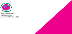
Business EnvelopeThis project was creating an envelope design for the business we made. A simple design, but I really like the pink color because it jumps off the page. This project helped me learn more about the tools in illustrator.
|
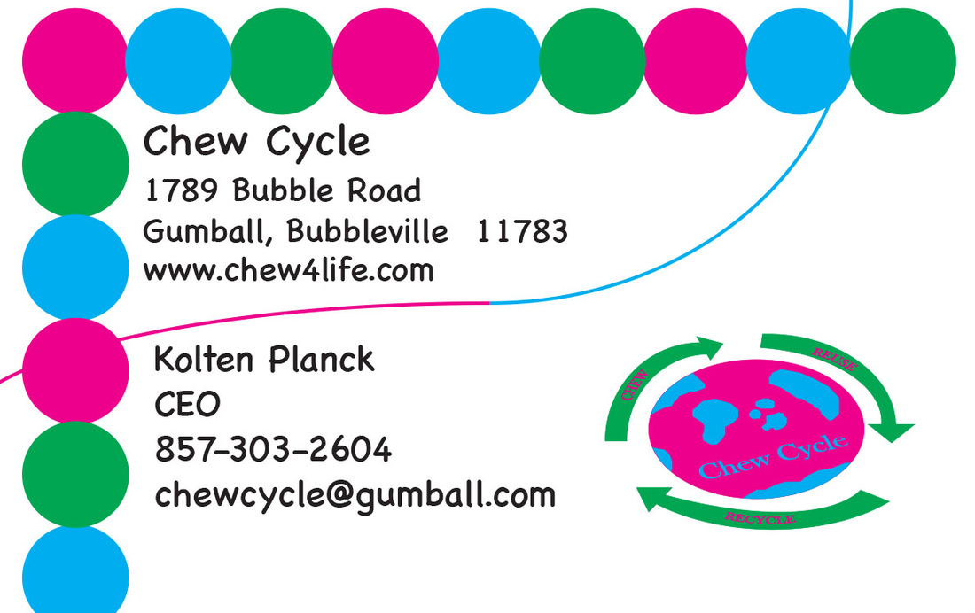
Business CardThe second part of the logo project was creating three more things that connect with it. The first one I did was the business card. I like it because the border on the card is pretty cool and the layout is nice too. This project continued to show me new things in illustrator as well.
|
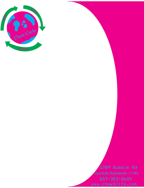
Business LetterheadThe next part to the logo project was creating a letterhead for the company. There isn't anything too special about this letterhead, but I like it because of the design on the paper. Just like the other two parts of the project it taught me illustrator which helped me for the end of the year projects.
|

Vintage Can Design:
This project was about making can designs. My can is Shooting Stars Kids Soup, the number one soup choice for kids around the world. This project was one of the first in Adobe Illustrator, so it showed me the basics of the application. It helped me greatly and overall helped my later projects. I named this Shooting Stars because I really like shooting stars and space.
This project was about making can designs. My can is Shooting Stars Kids Soup, the number one soup choice for kids around the world. This project was one of the first in Adobe Illustrator, so it showed me the basics of the application. It helped me greatly and overall helped my later projects. I named this Shooting Stars because I really like shooting stars and space.
|
Potato Face:
The point of this project was to put a human face on a piece of food. I chose a potato because I really like potatoes. This project taught me how to use layer masks, which is my favorite thing to do in photoshop now. Overall this is one of my favorite projects because it was one of the most fun to do. 
|

South Park Character:
The character above is based off of how the creators of the show, South Park, make their characters. This project needed us to make a character like the ones in the show. My character just got done climbing a mountain and is shown as he stands on the rock looking out over the world. This project taught me the basics of photoshop and helped my later projects. |

Colorblind Awareness:
This project was to create a poster for a real world problem that affects people today. I chose colorblindness because I had a friend who was colorblind a couple years ago. This is one of the last projects I did in illustrator and it shows major improvement from my first. I learned more about the pen tool from this project as it is the tool I used for almost the whole project. I like the text type on this poster because it looks like nice, neat handwriting.
This project was to create a poster for a real world problem that affects people today. I chose colorblindness because I had a friend who was colorblind a couple years ago. This is one of the last projects I did in illustrator and it shows major improvement from my first. I learned more about the pen tool from this project as it is the tool I used for almost the whole project. I like the text type on this poster because it looks like nice, neat handwriting.

The Google Doodle:
The final project of the class had me create a google design. I chose Christmas because it is just around the corner and it is my favorite holiday. I used everything a learned from past projects to make this design and it is by far my favorite project I did this year.
The final project of the class had me create a google design. I chose Christmas because it is just around the corner and it is my favorite holiday. I used everything a learned from past projects to make this design and it is by far my favorite project I did this year.
